


Data Without a Story is Just a Boring Spreadsheet
How to turn numbers into nail-biting narratives.


In Useful Fictions, Michael Austin makes the point that every human culture, from the dawn of time, has invested in stories. Why? Not just for entertainment. Storytelling gave us a survival advantage.
Long before we had Excel or data dashboards, early humans needed stories to make sense of their world—and more importantly, to help their tribe survive.
Imagine a group of early humans heading out for a hunt. When they return, they don’t gather everyone around the fire and just say, “We saw 5 bisons and 2 got away.” Instead, one of them shares a story about how they tracked a herd all the way to the forest edge, but the wind shifted, and the bison caught their scent. They tell how the youngest hunter made a noise at the wrong moment, scaring the animals off, but how they also learned the bisons are watering near the large oak tree at dusk.
This wasn’t just a campfire tale—it was actionable intelligence. The story conveyed critical information: where the bison are, how wind and noise affect the hunt, and when to return for better success. They didn’t need graphs to understand it. The narrative itself was data—passed along in a way that everyone could absorb and use for the next hunt. It was storytelling as survival strategy.
And even though we’re no longer tracking bisons, we’re still wired to need those stories to understand the numbers around us.
So, how does this apply to data storytelling? Simple: If you’ve got data without a story, you’ve got a bunch of numbers and no one cares. Add a story, and you’ve got people sitting up, paying attention, and—crucially—remembering what you’ve told them.
Why stories beat spreadsheets every time
I’m just going to say it: Data on its own is boring. A spreadsheet full of numbers makes people’s eyes glaze over faster than a meeting that could have been an email.
You’ve crunched the numbers, done the analysis, and now you’ve got these brilliant insights. If you just drop a pile of stats in front of your audience, are they really going to care? Probably not.
Jennifer Aaker, a marketing professor at Stanford, found that stories are up to 22 times more memorable than stats alone.
You don’t have to be a rocket scientist (or a data scientist) to see why that matters. If you want people to remember your insights, or better yet, act on them, wrap those numbers in a narrative.
Let’s say you’re trying to convey that your product trials have a 50% drop-off rate before users even complete onboarding. You could just present a chart with the numbers—or you could tell the story of "Alex," a user who’s excited to try your tool, but midway through the onboarding process, gets lost navigating all the features, becomes overwhelmed, and abandons the trial.
People will remember Alex. They’ll feel his frustration, picture him staring at too many options with no guidance, and understand why simplifying the onboarding process is critical. That’s what data storytelling does—it turns cold stats into real human experiences that stick with your audience.
When data storytelling isn’t necessary (but actually, it still is)
I get it. Sometimes, all you need is a clean dashboard to show the numbers, especially if you’re dealing with data pros or analysts. But here’s the thing—even a CEO looking at their fancy metrics still needs a narrative.
Maybe the dashboard tells the story, or maybe it’s up to you to do it. But without context, even a "just-the-facts" dashboard is lacking.
The best data stories hit a sweet spot between storytelling and exploration. Let your audience poke around and interact with the data—but give them guideposts, too. Otherwise, you’re just handing them a haystack and saying, "Good luck finding the needle."
How to turn data into a story (without writing a novel)
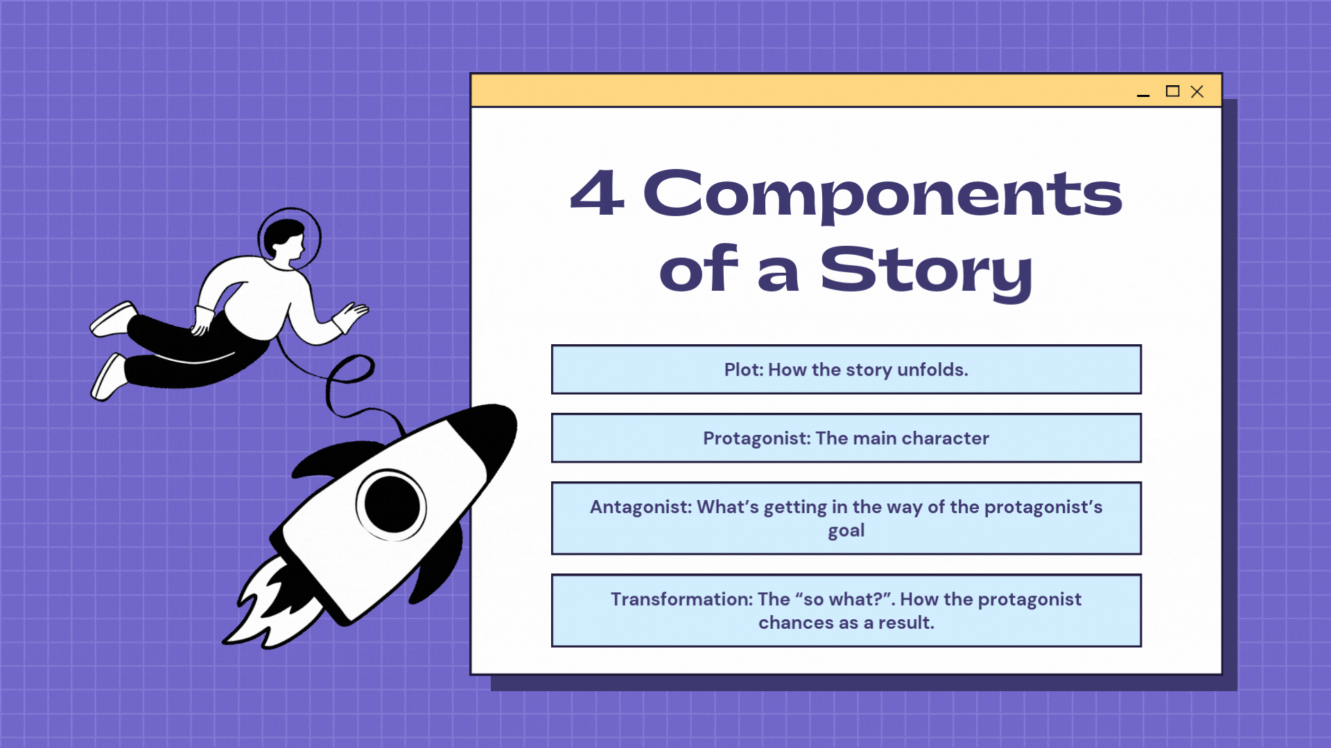
Start by asking: what’s the big takeaway? What's the transformation? What’s the “so what”? Just like any good story, your data needs a hero (the key metric), a challenge (the problem you’re solving), and a resolution (the insight that sparks action).
For example, instead of just presenting raw data about customer churn, tell the story of how churn has evolved over time, why it’s happening, and what can be done about it. Use your data as the plot points in that journey.
Even a simple story will grab attention and help your audience feel the data, not just see it.
So, the next time you’re tempted to just send out a raw data report, stop. Take a moment to find the narrative in those numbers. It’s the difference between people forgetting your insights—or them acting on them.
And that, my friends, is how you turn data into a superpower.