

SimplyCodes Case Study: Building a Zero-Cost AI Acquisition Channel in 6 Weeks
A product marketing case study on why showing value before asking for anything is the only playbook that matters in the AI era

When I joined SimplyCodes, I timed myself while searching for a specific coupon code. I spent 12 minutes copying and pasting coupon codes from all over the internet. Twelve. Minutes.
I tried SAVE20 (expired). Then WELCOME10 (new customers only). Then FALL2023 (it was spring 2025). By the time I found a code that worked, I saved $3.50 but lost a quarter of my lunch break.
The sad truth for the consumer is that coupon sites prioritize codes that pay them the highest commissions, not the ones that save shoppers the most money. They use codes as data collection honeypots, track your every move across the internet, and worst of all, they've trained millions of shoppers to accept that testing six expired codes before finding one that works is just "how it is."
The business model doesn’t require working codes. It requires clicks. Affiliate commissions. Data collection. The more codes you try, the more money they make.
This is not just about bad codes. It’s about an entire marketing playbook built on the wrong foundation: SEO-stuffed pages, email capture, gate everything valuable, make users work for savings. A/B test until you squeeze out every last conversion.
But while everyone was optimizing yesterday's funnel, the world changed. AI agents like ChatGPT started becoming how people find information. Google's AI overviews began surfacing direct answers. Suddenly, that SEO-first, extract-everything playbook wasn't just annoying. It was obsolete.
If your growth strategy is still built on tricks and extraction, you're basically bringing a butter knife to a gunfight.
We decided to build something different. Not a better coupon site, but to use technology and the power of community to help users save.
From a strategic point of view, it was important to depart from the “Coupon Platform” category because our point of view is very different to traditional coupon platforms, not only from an ethical perspective, but by design. This gives way to building and owning a new category: Intelligent Shopping. This space combines two key elements:
Saving smart: Making it intelligent to never pay full price
Shopping smart: Personalized, context-aware experiences
The first place we wanted to bring this new positioning to life was in our website. We were not being honest to begin with. This is how our hero banner looked like before.
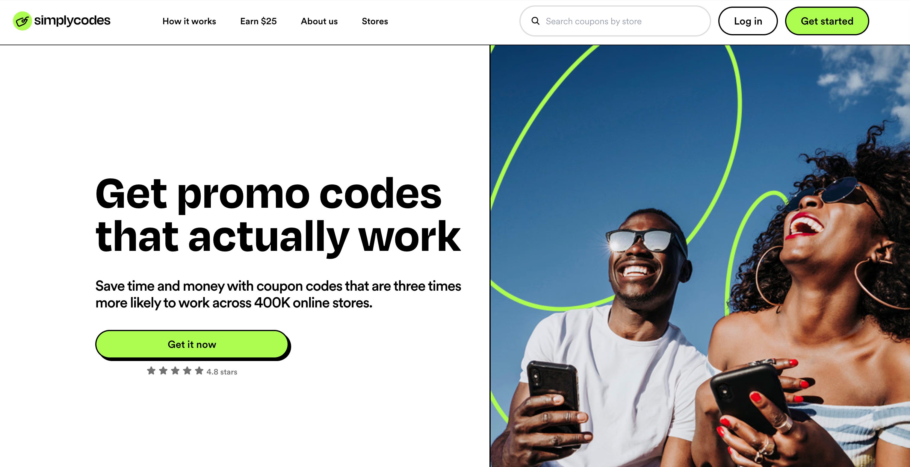
No one can promise codes that actually work because coupon codes are inherently volatile. Brands decide the rules and the right to cancel them any time.
And then my biggest pet peeve in product marketing. The “Tina Turner moment”:


It’s not the same when Tina says it than when you say it about yourself.
Earning Trust Through Honest Value
Our old homepage was purely transactional. Download! Install! It's free!
But "free" is never free. Users pay with their most valuable currency: time. Time to download, time to learn a new tool, and time spent testing six invalid codes to find one that works. We were asking for their trust before we had earned it.
So we flipped the equation. What if we delivered our product's core value, instantly, before asking for a single click of commitment?
I know what you're thinking: "But what about conversion rates? What about your funnel metrics?"
Here's the counterintuitive thing we discovered: when you obsess over conversion rates, you optimize for the wrong behavior. You get really good at tricking people into downloading something they'll uninstall in a week. We wanted to optimize for actual value delivery, even if it meant our traditional metrics would tank initially.
This led to a design philosophy centered on affordances, making the interface itself demonstrate our value.
The concept comes from psychologist James J. Gibson, who originally used it to describe what the environment offers to an animal. Designer Don Norman later adapted it for design, distinguishing between real and perceived affordances.
Good affordances make interfaces intuitive and reduce the learning curve. When affordances align with user expectations and mental models, people can use products without instruction manuals or extensive training. Poor affordances lead to confusion, errors, and frustration - like doors you push when you should pull, or clickable elements that don't look clickable.
The key is making the intended actions discoverable and obvious through visual, tactile, or auditory cues that match users' expectations and prior experiences.
Affordance thinking transforms website messaging from explaining what you do to demonstrating it through the interface itself. Instead of telling visitors "we make things simple," your design choices should make that simplicity immediately apparent and usable.
Most websites rely heavily on explicit messaging:
"Our platform is intuitive and easy to use"
"We provide fast customer support"
"Our process is simple: just 3 easy steps"
"We're the trusted choice for thousands of businesses"
This approach requires visitors to read, process, and believe your claims. It's cognitive work with no immediate payoff.
When you apply affordance thinking, the interface itself communicates your value. Here’s what that actually looked like on the new SimplyCodes homepage :
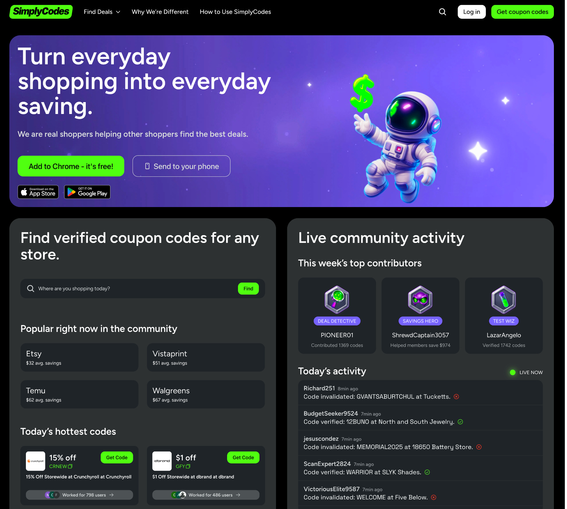
Instead of "We save you money" → We show actual coupon codes, live success rates ("78% success"), and average savings for top stores ($64 at Amazon) that visitors can use immediately.
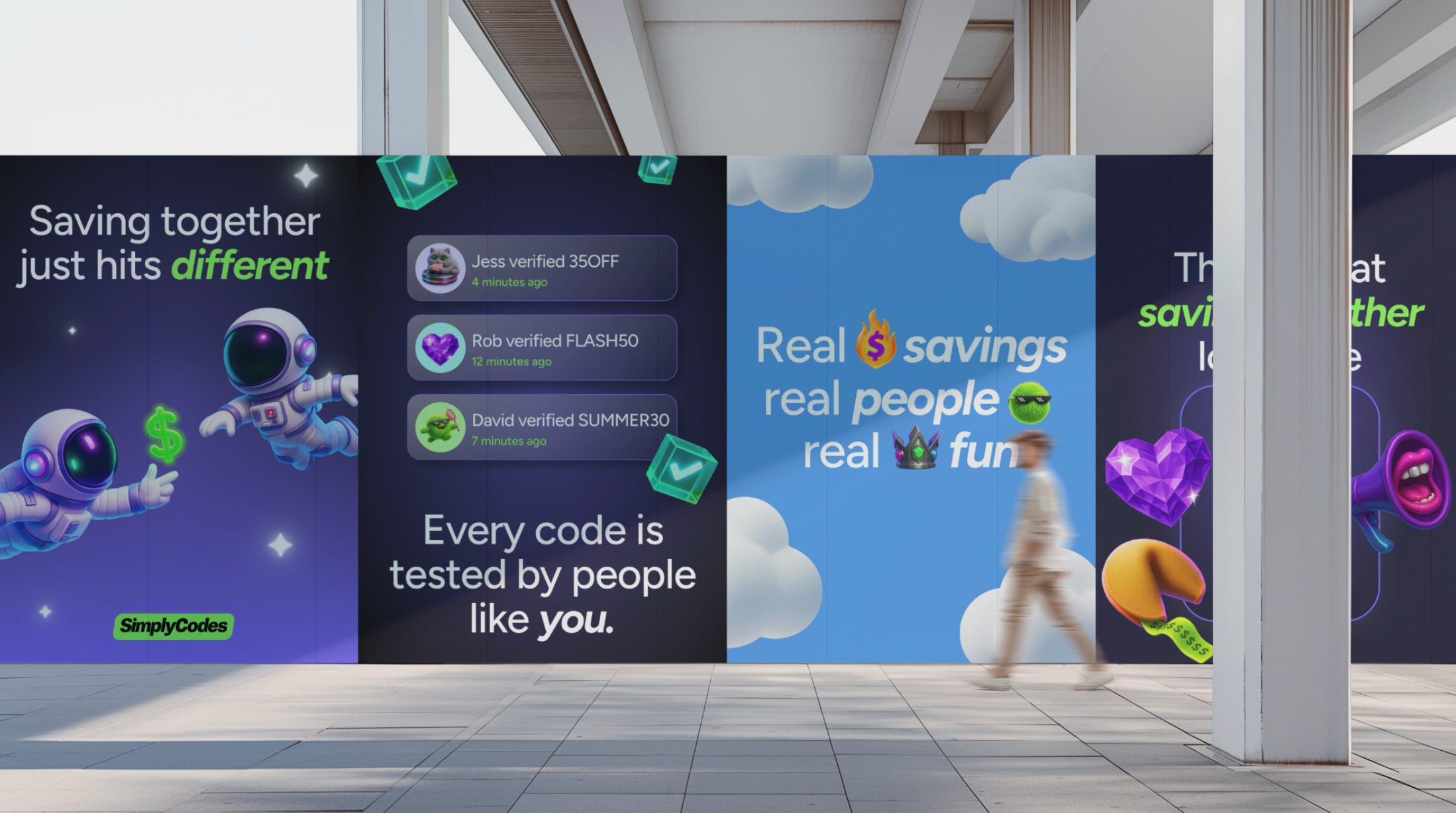
Instead of "Real shoppers trust us" → We display a live feed of community activity ("Sarah verified WINTER30 4 min ago") and feature top contributors with their real avatars and verification counts. Trust is shown, not claimed.
Instead of "We have the best codes" → A search bar sits front and center. "Where are you shopping today?" it asks. Try us. See our value right now. The proof is in the search results.
No signup. No download. Just... here's the goods.
It’s all about providing the critical context users need: success rates, time-based validity, community verification, and even explanations for why certain codes might fail.
The Playful Rebrand
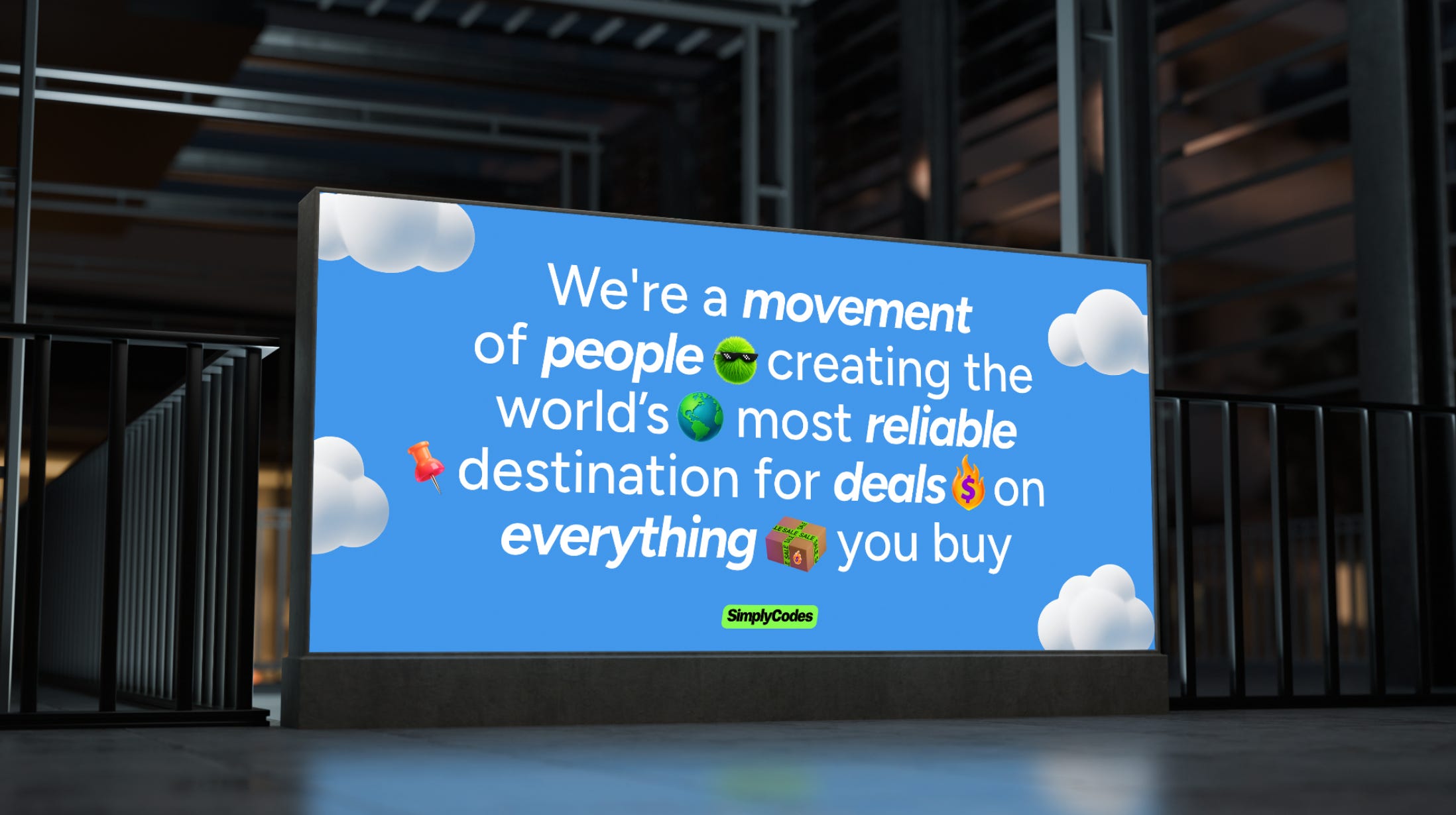
Our new visual identity celebrates our rebellious spirit in a playful way:
An astronaut exploring the vast and sometimes dark space of shopping deals online
A unicorn wearing sunglasses (because we're building something that doesn’t exist in this industry)
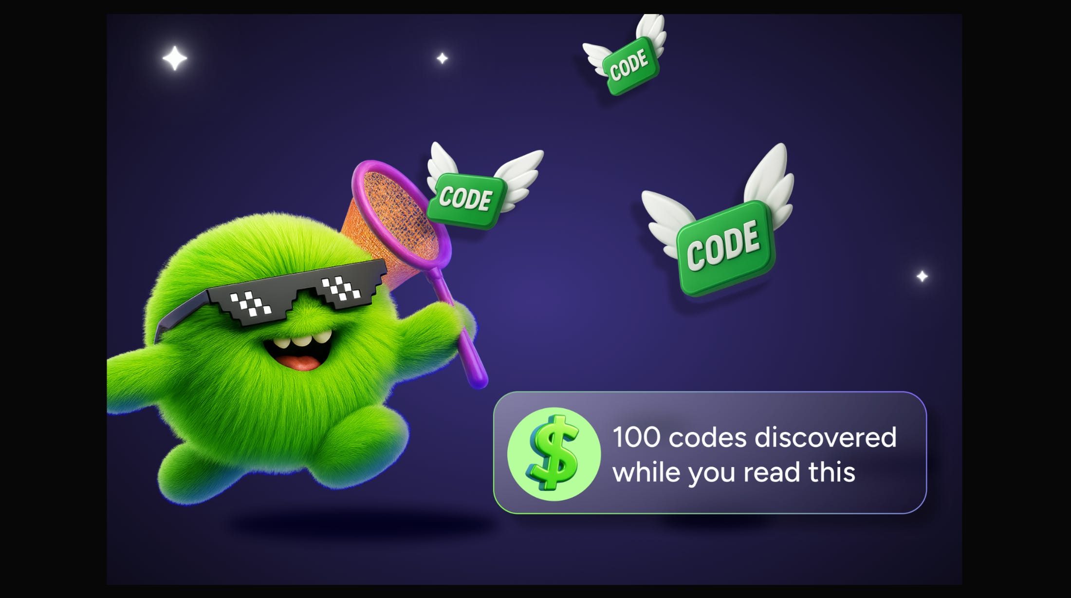
Fuzzy green monsters catching codes with nets, and helping ghost data disappear and not haunt you (a bit of Pac-Man nostalgia, just because we love old school gaming)
An octopus with VR goggles examining shopping carts, data, and classifying deals
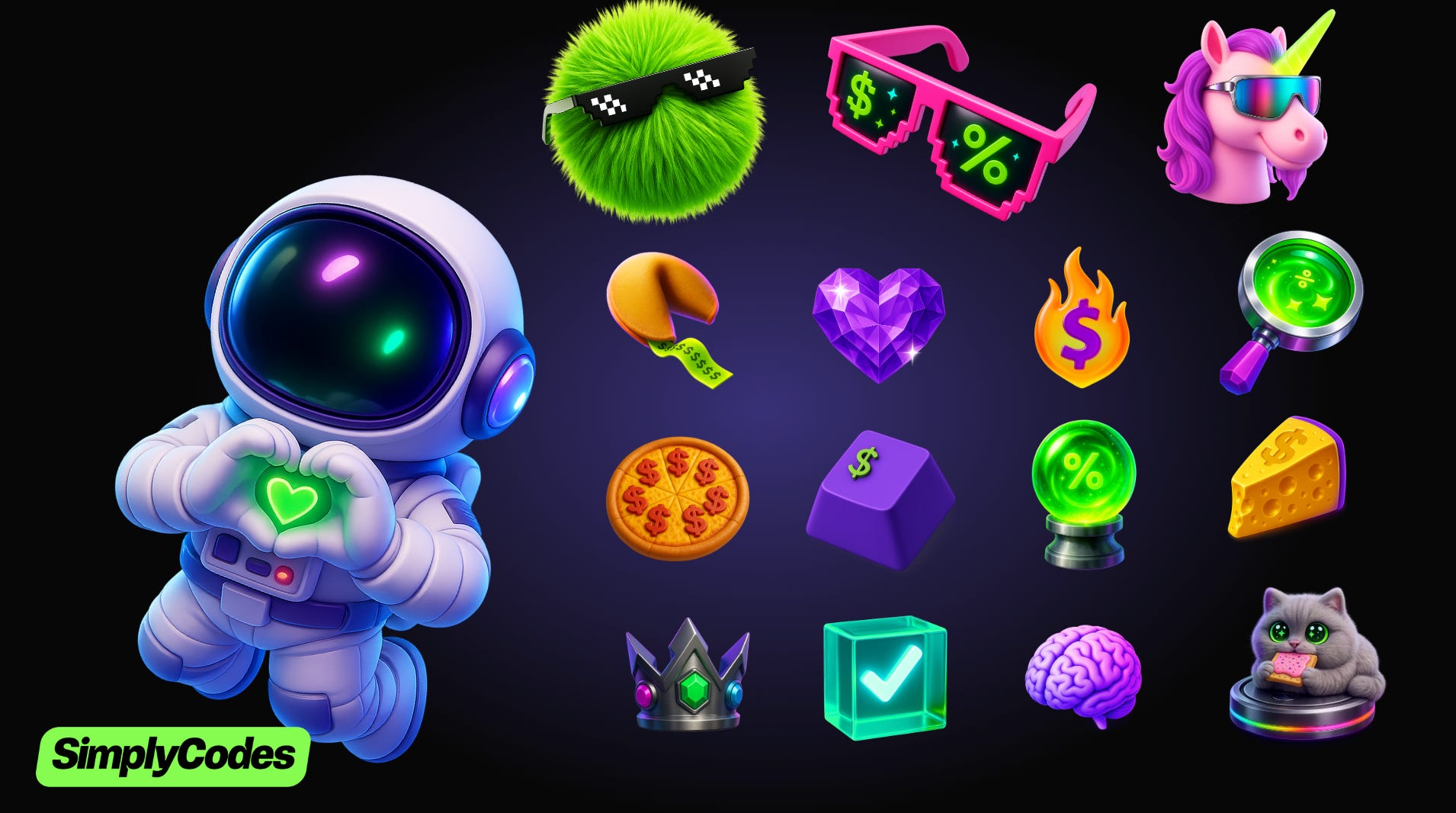


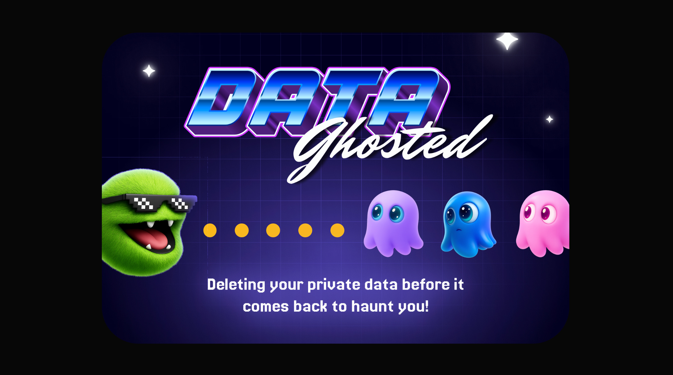
Why playful? Because saving money should feel good. The illustrations make complex features feel approachable and turn our community's contributions into a movement worth joining.
Brand Art Direction: David Guzman, Senior Visual & Brand Designer at Demand.io
Our 6-Week Sprint (Or: How Deadlines Saved Our Butts)
The rise of AI agents like ChatGPT is fundamentally changing how users discover and interact with brands, creating a ticking clock for anyone whose growth model relies on yesterday’s rules.
Our catalyst was the urgency of the AI shift, this shift was happening with or without us, and our constraint was a non-negotiable 6-week deadline. This forced brutal prioritization and transformed our process.
Weeks 1-2: Confronting the real enemy. Our research phase focused not just on competitor dark patterns, but on the deeper user anxiety caused by not knowing if a code was going to work or if they were getting the best possible deal. We mapped the journey of doubt and frustration shoppers face.
Week 3: The human & machine narrative. Every page needed to work for two audiences: humans who want to save money, and AI crawlers trying to understand what we do. So pages like Why SimplyCodes is Different became these beautiful hybrids: emotionally resonant stories for people, and a rich, semantically structured data source for AI crawlers, using Schema.org and a clear, logical flow.and natural language that would help AI systems understand and recommend our service. Not everyone is going to have the time and curiosity to read all those words, but the type of deal enthusiast we love will. That’s all I need.
Weeks 4-5: Building the "Immediate Value" experience. The design and engineering teams brought the "show, don't tell" philosophy to life, building the interactive homepage that served as a working version of our product.
Week 6: The first true launch. This wasn't just a release. It was a fully orchestrated moment that required connections between design, engineering, and community teams who'd never collaborated this closely, ensuring our internal teams and external messaging were in perfect sync. We weren't just pushing code; we were presenting a new vision to the world.
The Results: A New Channel and a New Category
Six weeks. That's all it took to flip our entire positioning. While it's still early, the initial results have validated our contrarian strategy:
Increased engagement: Daily users on the new homepage saw a tangible increase, and its share of total site users grew by over 4.5%, proving the "immediate value" approach was attracting more visitor attention, and those visitors where not only trying us, but signing up.
A brand new, zero-cost acquisition channel. SimplyCodes began appearing as a trusted source in ChatGPT answers proving that our "Human & Machine" narrative strategy was working. We weren't just optimizing for yesterday's search engines; we were becoming the intelligence layer for tomorrow's AI agents. This represented a fundamental shift in how users could discover and interact with our brand.
We didn't just launch a new homepage. We changed the entire conversation about what a coupon site could be and refused to be placed in the same bag as traditional coupon platforms. If you don’t define yourself, others will do. By creating the "Shopping Savings Intelligence" category, we shifted from competing on features to defining a new market.
In the age of AI, the most durable growth strategy isn't about extraction. It's about building on a foundation of genuine value and radical transparency.
The Playbook: 7 Lessons for Modern Product Marketing Teams
Your enemy isn't a competitor; it's customer chaos. When you fight the real problem in their life, you build something they actually want to join. Frame your mission around universal user frustrations, not competitive features.
Deliver value before the ask. The traditional funnel is dead. Prove your worth instantly. Your product itself should be your most persuasive piece of marketing. This requires confidence in your value proposition and a willingness to invert traditional conversion tactics.
Write for Humans and Machines. Your next big acquisition channel won't be a search engine; it will be an AI assistant. Craft your narrative with rich, structured data that both resonates emotionally and informs algorithms.
Create moments, not just features. Bundle your releases into launches that tell a story worth sharing. The difference between shipping and launching is the difference between product development and market development.
Constraints breed creativity. Our six-week deadline wasn't a liability; it was our greatest asset. It forced focus, eliminated debate, and led to more creative solutions. Use time pressure to drive clarity and prevent scope creep.
Transparency is your superpower. Technology can be copied. A community built on radical honesty cannot. Turns out, admitting what you can't do builds more trust than pretending you're perfect. This radical honesty becomes a differentiator in a market full of overpromises.
Personality is a competitive advantage. In a world of corporate sameness, our playful astronauts and quirky illustrations make saving money feel approachable and fun. Personality is memorability and being memorable is being valuable. Don't confuse professionalism with blandness.
"Stop optimizing yesterday's funnel. Start building tomorrow's category."
Your Turn: The Challenge
The old playbook is dead. What sacred cow in your industry needs slaughtering? What "best practice" is actually keeping you from your best customers?
Here's my challenge to you: Pick one thing everyone in your industry does because "that's how it's done." Question it. Flip it. Test the opposite for just one week.
Then come tell me what happened.
I had a blast chatting with Shruti Verma on the Behindthebrief podcast about the difference between launches and releases (and why most teams get it wrong), how to bring product, design, and engineering into the product marketing fold without bruising egos, and my framework for writing content that resonates with both humans and AI. Plus, why our "only codes that work" positioning was actually our biggest mistake. Check it out, and be sure to follow her podcast →
Want to discuss this case study or share your own AI-era growth story? Let's connect: