


Storytelling isn't Just About Words
See the impact of visual narratives.


If I start by saying visual storytelling is key for your brand, I wouldn’t be dropping a bombshell.
Think about it: the most iconic brand campaigns stick with you because of their visual storytelling. Showing, not telling, is the gold standard for marketing. And guess what? Science agrees. MIT researchers found our brains can process an image in just 13 milliseconds.
So, why do we make an effort to nail this in big campaigns but miss it in other marketing touch points? Websites, for example, often miss the mark. Best case: the images are just pretty decorations. Worst case: they’re confusing or dull.
Story-driven web experiences are on the rise. Marrying storytelling with intuitive design can turn your website into a captivating, visually stunning, and informative space.
Ready to see some good, bad, and ugly examples?
Let's dive in starting backwards —just because I always like to end on a positive note.
The Ugly

Why This is Ugly:
In this example, the image is just decoration. It doesn't tell any story or support the copy. If the image were removed, nothing would be missed. The image should add value to the story, not just be a decorative piece.

Why This is Ugly:
Nothing in this image is memorable. The mobile screen is too unclear to understand, making it confusing. It doesn't add any value to the story or support the copy. In fact, it's so dull and uninformative that the copy would be more effective without it! The image should enhance the message, not detract from it.

Why This is Ugly:
This is an old image from when I joined GoDaddy to take care of this product. Unfortunately, nothing in this image tells me I will be able to design without design skills. The image doesn't show any exciting outcome other than the fact that I will be able to add text, which obviously doesn't require any design skills. Check out the updated version in the "Good" section!

Why This is Ugly:
The image is trying way too hard to explain something but isn't quite hitting the mark. It's tough to connect the image with the copy, making the viewer work too hard. If you hide the copy, no one would have a clue what the image is trying to communicate. It’s like those wild Pictionary sessions where everyone’s just a little off their game!

Why This is Ugly:
The image relates to the copy, but the execution is off, which could undermine the product's reputation. It doesn't inspire much trust in the feature or the product. It needs a better design to truly shine and tell a better story.
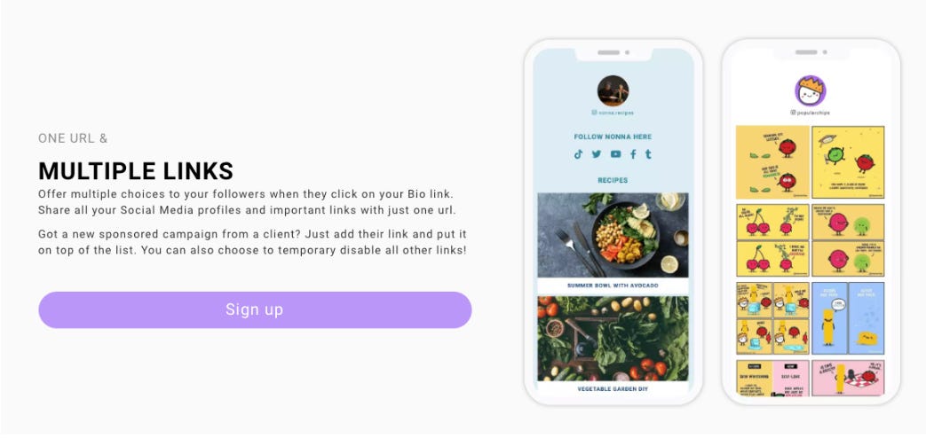
Why This is Ugly:
The image is messy. It's trying too hard to represent "multiple links" but ends up creating multiple layers of confusion. It makes me think the tool itself will be just as confusing!
The Bad

Why This is Bad:
The image is trying to communicate a concept but falls short. Visuals need to be crystal clear when conveying ideas. Here, the viewer has to work too hard to figure out what's going on. Good visuals should support the copy and make the message easier to grasp. Bad visuals compete with the copy and demand extra effort from the viewer.

Why This is Bad:
The image is aesthetically pleasing, but it's telling a different story than the copy. While the image suggests the tool works on both desktop and mobile, the copy is about hassle-free social media scheduling. This mismatch creates confusion. Good visuals should align with the copy to enhance the message, not send mixed signals.
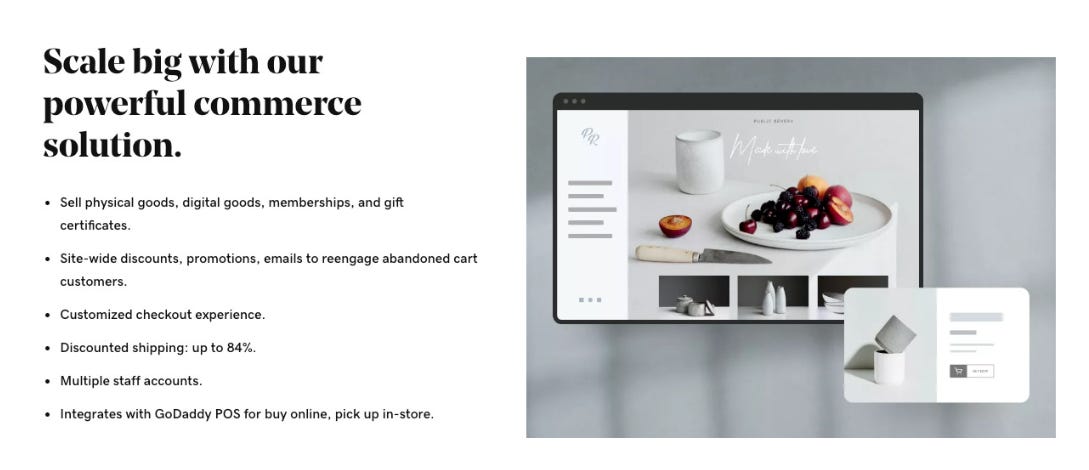
Why This is Bad:
The image looks nice, but it doesn't support the copy. It fails to back up the promise to “scale big”, the "powerful" statement in the headline or the versatility promised in the body copy. This was a perfect chance to , for example, display physical goods, digital products, or memberships. If we remove this image, we wouldn't miss out on anything important.

Why This is Bad:
Here’s another example of a pretty image that has nothing to do with the copy. The copy itself isn't great either – it's too functional and missing the benefit. It could be something like "Easily customize text and images with inline editing" or "Customize text and images inline – no editor needed." The image could have shown this and done the heavy lifting in telling a more engaging story. When we use very functional copy, especially if space is tight, a good image can tell the benefit story by showing, not telling.
Why This is Bad:
Visually, the image isn't terrible, but it's confusing and unclear. It makes the viewer work too hard to figure out what's going on. Instead of highlighting the feature's value, it just creates frustration. A good image should effortlessly show the key message and improve understanding, not leave viewers scratching their heads.
The Good
Let’s look now at two different products using similar executions to showcase analytics features.